Heavy Medal Mock Newbery Finalist: BLUE: A HISTORY OF THE COLOR AS DEEP AS THE SEA AND AS WIDE AS THE SKY by Nana Ekua Brew-Hammond
Introduction by Heavy Medal Award Committee member Jenny Arch
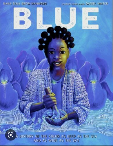
Brew-Hammond begins this a global history of the color blue with an observation and a question: “The color blue is all around us. Have you ever wondered where it comes from?” She continues, riddle-like, “It’s in the sky, but you can’t touch it. It’s in the sea, but when you cup it, it disappears.” BLUE traces the ways that people have sought, created, and used the color across the world and throughout history, from ground lapis lazuli as makeup or paint, to snails and indigo dyes. Blue is “more than a color. It [is] a feeling”; Brew-Hammond connects the painful history of those who worked to dig lapis lazuli or grow indigo – often enslaved people – to the common expression of feeling “blue” when we’re sad, or the style of music called “the blues,” which has its origins in African spirituals.
Daniel Minter’s gorgeous illustrations (Caldecott contender?) done in acrylic wash on watercolor paper showcase every shade of the titular color: in sky, water, cloth, jewelry, and religious uses. Even the endpapers are beautiful, emulating the “stunning pattern[s]” of Nigerian indigo fabric. The people depicted are from various times and places, including ancient Egypt, Phoenicia, Indonesia, Mexico, Israel, and West Africa.
ADVERTISEMENT
ADVERTISEMENT
This valuable history of a beautiful color with a “complicated history” comes with rich back matter, including an author’s note, “a few blue facts,” and selected sources (both online and in print). Its unique presentation of information could make it a Newbery contender.
Heavy Medal Award Committee members and others are now invited to discuss this book further in the Comments section below. Please start with positive observations first; stick to positives until at least three comments have been posted or we reach 1:00 pm EST. Let the Mock Newbery discussion begin!
Filed under: Book Discussion, Heavy Medal Mock
About Steven Engelfried
Steven Engelfried retired from full-time library work a couple years ago and now works as a part-time Youth Librarian at the West Linn Public Library in Oregon. He served on the 2010 Newbery committee, chaired the 2013 Newbery Committee, and also served on the 2002 Caldecott committee. You can reach him at sengelfried@yahoo.com.
ADVERTISEMENT
ADVERTISEMENT
SLJ Blog Network
Now on The Yarn Podcast: Mk Smith Despres
Remember (the) Maine: A Stroll Around Kittybunkport with Scott Rothman
5 Unlimited Access Digital Comics to Boost K–8 Reading | Sponsored
When Book Bans are a Form of Discrimination, What is the Path to Justice?
Fast Five Interview: Amaka Egbe
ADVERTISEMENT



Thanks for the intro Jenny! I was most impressed with Brew Hammond’s development of theme. clearly the theme is the color blue, but she goes so deep in an entire analysis of the color and it flows so well. How she transitions from time periods to feelings is very well done especially in such a short book!
Here are some transitions I appreciated:
“From the time blue was found, scientists worked hard to make a blue that wasn’t so difficult or cruel to produce.”
“Because of its scarcity, mystery, ans holy associations, blue was more than a color. It was a feeling.”
“And blue is still considered extraordinary as it was once the color of royalty. This could be why, around the works, blue ribbon are pinned for first prize.”
I totally agree, Emily! The thematic structure really made this stand out for me when I first read it months ago, and drew me back in on a re-read.
I agree too. I thought that the writing was fantastic and I am going to use it as a mentor text with my students when we work on sentence craft.
This book answers questions that swirl in kids’ heads, and mine too. The riddle that Jenny refers to pulls you in at the onset, and Brew-Hammond’s facts just keep coming. This book will appeal to a wide audience: younger kids will be drawn to the beautiful illustrations (and may even find their own skin color!), geography buffs will stay engaged, and then older fact seeking readers will love the back matter. I agree with Jenny – really interesting and important connections are made.
I agree Maura that this is a book that will appeal to many ages. For me, I love that the author has woven in the theme of social injustice and inequities to give the whole picture to the story of blue. Is it Newbery worthy? I definitely agree with Jenny that it should be a strong Caldecott contender.
So for it to be Newbery worthy, the strengths of this nonfiction picture book would have to outweigh any value that I would place on character or plot. That seems like a tall order for a fiction lover like me…
Kate, I think it could be Newbery worthy, but it just depends how it compares to others in the competition. It certainly is much harder for a picture book when up against middle grade fiction that has much longer time to develop plot and character. What I would point to for this particular title is the interpretation of theme, presentation of information and and appropriateness of style. Of those three, I thought the thematic development was extraordinary here! She used a seemingly straightforward topic to explore the complicated relationships between humans, as well what an important role color has played in our historical and contemporary lives. And all within 32 pages! I am not sure how it stacks up against the rest of the field, but it certainly is an impressive title all on its own. Thanks for your post!
This is a second reading for me of this title. What struck me this time, Maura, is how Brew-Hammond created the conditions for the reader’s curiosity. The “history of blue” is not likely something that the reader either thought of or even curious about. And yet, with some simple questions and the riddle-like opening that many have already mentioned, she gently nudges us to consider some new questions. When diving into the historical aspects, she never strays away from the human component and always makes important connections for the reader. The through-line of how humans are impacted by color is well developed and is seen throughout the illustrations and text. Beautifully done!
The deep, rich illustrations of this book are gorgeous, so I can definitely see it getting Caldecott attention. In the text, what I loved most was the opening described in this post (the riddle-style would have appealed to me a lot as a child), as well as the discussion of feelings associated with the color. I didn’t realize that blue wasn’t more accessible as a color until so recently (1905, I believe it said)? So I think kids will find a lot of new, interesting info in this book.
We heard, in Newbery lore, the stories about struggling to separate a text from the images–and this is one I can definitely see the committee having to type up so they aren’t influenced by the gorgeous illustrations.
Excellent point! The illustrations are just amazing. That would make it tough to separate, for sure.
This is my struggle with it as well.
Caldecott: see HUGE possibilities for it. Even the Sibert Medal and informational text
But Newbery….I feel it lacks more of the criteria than it meets.
I agree with all about the really rich connection between the text and illustrations. I like the suggestion of reading the text separate. I may have to type it up and see how that changes the impact. The text does flow together really nicely, and I don’t know how much the illustrations impact that.
How heavily do we consider the back matter when looking at the text? I think this title, as well as BERRY SONG, have really enriching back matter. (Whereas I don’t think FARMHOUSE’s back matter contributes as heavily to the overall text.)
But then I wonder if the target age for picture books is an age that really reads backmatter. For example, the FARMHOUSE backmatter is wonderful but I can see it appealing more to adults. Do kids pay much attention to that section of a story?
My students generally ignore backmatter unless there are photographs (which does give an edge to BERRY SONG and FARMHOUSE). I’ve been reading FARMHOUSE to my 3rd-5th graders and only summarized the backmatter and showed the pictures, as I think it enhances the illustrations more than the text. As for BLUE, I can see kids browsing the facts but otherwise ignoring the author’s note and bibliography. BLUE’s backmatter is more of an extension, rather than being necessary to fully appreciate the rest of the book.
That said, it goes back to my original question of how much we consider backmatter when considering the text of the book. If this an award for books for children, does it take away from a title when a large chunk of text will be ignored by the target audience?
Thank you for the introduction Jenny. I agree Emily and Aryssa that the thematic structure really stands out. Brew-Hammond summarizes her in-depth structure on the last page: “Maybe because blue has such a complicated history of pain, wealth, invention and recovery it’s become a symbol of possibility, as vast and deep as the bluest sea, and as wide open and high as the bluest sky”. The last page ties back to the first page: “The color blue is all around us… It’s in the sky… It’s in the sea…” I was struck by Brew-Hammond’s graceful prose and fluid organization.
Brew-Hammond definitely showed the human interactions with the color blue, and made me look at the color blue in a whole new way.
I thought it was interesting that the illustrations depicted all the people as black except the scientist, Adolf von Baeyer. And also, I was expecting the pages of a book about the color blue to be mostly different hues of blue, but instead the pages are illustrated in many hues of oranges, browns, greens and yellows, with little or no white space on each page.
I think this was a great picture book to start with. This was knowledge I knew a little bit about, but this went into some great detail without overloading the reader. It’s simple but also eye-opening. But like others have said or alluded to, I’m not sure it’s a good Newbery fit. With something like this, I think about “Watercress,” which got an Honor last year obviously. That story is so vivid and works very much independently, and it’s only elevated by those award-winning illustrations. Perhaps because the text here in “Blue” is more informational, the text isn’t as captivating to me personally. There are definitely poetic moments, and the tie-in that the author makes to injustice makes this more than just nonfiction, but to truly tell that story it’s pretty dependent on those illustrations. Which of course, are lovely–hoping this is on the Caldecott radar. But again, this mostly works as a package in my opinion.
From what I understand, each committee must on their own interprets the rules on pictures from year-to-year, so they as a group decide whether they will focus on just text, or be more inclusive and let the pictures factor into judgment.
I liked this book because it really gives you a sense of the feeling of blue. This book tells the story of the color blue and the hardships and sorrow it took to get that color. This book does a good job showing the many aspects of blue good and bad happy and sad. The ilistrations are also gourgus. Like others I’m not sure I see this winning the Newbery though I think it could get an honor or possibly Caldecott considering how strong the pictures are. I hadn’t thought to read the text without illistrations I may have to try that and see if it reads differently.
I don’t know about anyone else, but going from BLACK BIRD to BLUE–a fiction to nonfiction–was a bit jarring for me. It is like comparing apples and oranges. I love them both, but they are very different fruits. I mean books 😉
Everything that stands out to me, including Jenny’s acknowledgement of the end papers, makes it more fitting of Caldecott criteria than it does for Newbery. The illustrations are what make this book come alive. (My favorite being on pg. 4-5 where Black women and irises are one. Oh I love it. Same with page 10-11 and talking about different ways of releasing color).
Thematic structure has been addressed previously and while there are pages where it excels (see the last page), I am struggling to reconcile if those moments are enough to make this Newbery worthy.
Evaluating books where illustrations are so prominent, like BLUE, is definitely challenging. The Newbery Terms and Criteria mention illustrations just once: “Other aspects of a book are to be considered only if they distract from the text. Such other aspects might include illustrations, overall design of the book, etc.” They also state that the award is for “distinguished writing.” An over-simplified restatement of that might be: “ignore the pictures unless they’re bad.” But that’s not the same as “the words must stand on their own.” In a book like BLUE, the writer chooses what to say and how to say it, allowing the pictures room to fill in some pieces. The author describes how poverty, slavery, and abuse played a role in the growth of indigo. The illustration, showing blue shadowed workers on a reddish field, is vivid and emotional. It focuses more on the plight of the slaves and workers, while the words are more directed at the oppressors. I think the visuals and text work perfectly together. From a Newbery lens, though, we have to evaluate if the words achieve a level of distinction within this particular book. Very challenging. And we’ll surely have similar discussions with BERRY SONG, AIN’T BURNED ALL THE BRIGHT, and SWIM TEAM…
When you’re on an ALSC committee that gives awards, they give you a document with guidelines and one of the guidelines discourages members from criticizing a book because it may be a better fit for a different award. I think this was intended to stop members from saying things like, “This is more of a [insert other award] book, so we shouldn’t consider it.” I’m sure I have this document in my email somewhere, but I can’t find it right now.
This book presents so much history in such a short amount of time. I loved how the color blue was discussed not as just a color, but the implications the color had throughout history and its impact on society.
While evaluating this book solely in terms of text I think we would miss out on much of this book without the stunning images. I really think the images are necessary in this case.
There are so many strong and well-thought out points here.
I would argue that this books strengths don’t necessary need to outweigh character or plot, simply excel in the relevant criteria (theme, style, presentation etc.) and stand out as a whole. (And yes, it’s so hard comparing such different books, but I think that’s one of the really amazing things about the Newbery, how broad a spectrum it covers. And I really love watching the awards announcement and seeing books I admired win in other categories, because then I know their strengths were recognized somewhere!
That all being said, now that we’re later in the discussion I still appreciate the theme and development in Blue and think that it is one of our strongest contenders!